New Audi Logo: Four Rings, Less Bling
The sleek, minimalist new Audi Logo design exemplifies the less is more school of design, and gives the Rings a futuristic feel.
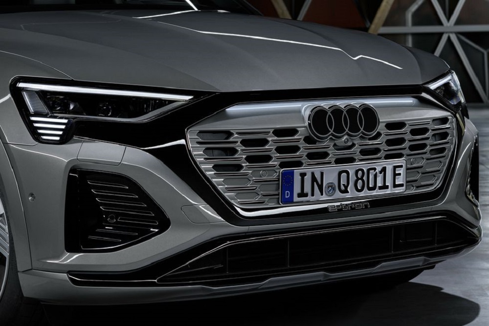
Right now, Audi is pivoting hard toward electric cars, with its Sphere concept vehicles showcasing the sleek lines that’ll characterize future models. So it shouldn’t come as a big surprise that it’s also giving its venerated Four Rings logo a refresh. Overall, it’s very similar to the old design, and still references the quartet of Auto Union brands which would merge to form Audi. That said, there are some distinct differences.
For one, the logo is now two-dimensional, and instead of being chrome, the famous rings are black and white. In explaining the move toward minimalism, head designer Marc Lichte offered that “Good design is less design.” Another motivation for going with a flat logo is that it will appear the same whether it’s on vehicles, billboards, or magazine ads. The 2024 Audi Q8 e-tron will be the first to feature the updated Rings.

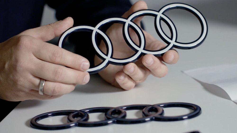
If this restrained new take is still somehow too flashy, the company will also offer a black-and-gray version. But the reveal puts to rest any question — not to say many people had them — as to whether next-generation Audi vehicles would sport any light-up emblems, like German rivals Mercedes-Benz. In another change, new models will feature laser-etched script detailing the make and model on the B-pillar, in a unique font called Audi Type.
To see how the new logo looks on a vehicle, check out the video of the 2024 Q8 e-tron below — and keep your fingers crossed we don’t have to wait too long to see it on the electric R8 replacement! That said, what do you think of the new logo? Does it work well with the design language we’ve seen on Audi’s latest progress? Is it too restrained, or does the new simplicity give it a futuristic feel? Hit me up and let me know!
Photos: Audi