The new Audi logo: trade fair debut at the IAA
As we see it, Vorsprung durch Technik is a clear promise to our customers and an obligation for all Audi employees to render our design even more innovative, our drive systems even more efficient and our product range even more emotion-packed, says Peter Schwarzenbauer, Member of the Board of Management for Marketing and Sales at AUDI AG.
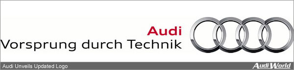
Audi has made it possible for customers to experience Vorsprung durch Technik firsthand with technical innovations such as quattro all-wheel drive, intelligent aluminum lightweight design and highly efficient diesel technology. For the first time, the brand claim has now been combined with the brand trademark, the four rings, in the various versions of the new logo. The rings are still the visual focus of the new logo, but their altered surface and new profile give them an even more contemporary look.
The new typeface Audi Type is also part of Audis evolved Corporate Design. It was the result of an international typography competition and has already been in use since the start of the year. Its aim was to enhance the independent character of the Audi typeface clear, minimalist and technical.
The Audi color code, used in all communication media, has also been further developed and will be used even more stringently with the new Corporate Design. As main color, aluminum silver represents technical innovative power and lightweight design, an Audi core competency and one of the most important future technologies that set the brand apart.
Starting in September, the new logo will be used in all communication measures: from classic advertising, publications and Audi press kits to sponsorship and the Audi website. The redesigned logo already made an initial debut at the Audi brands 100th anniversary celebrations. The new Audi logo will be used internationally for the first time during its trade fair debut at the IAA. There it will add the crowning touch to the white, red and black
|